Nostalgic, but not at all dull and dusty
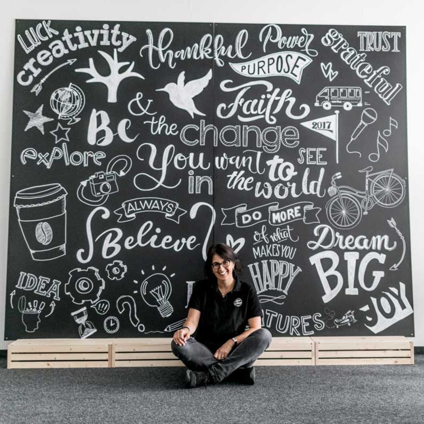
The more digital our times become, the more personal something handwritten feels. This also applies to blackboards: they are aesthetically pleasing and useful, and they exude urban flair – even in Zurich. We take a look at this trend.
Handwritten menu boards are cropping up more and more often outside restaurants and bars in Zurich. The trend towards handwritten lettering came to us from Australia and Britain a good ten years ago. ‘Hand-lettering’ is the name given to the art of inscribing letter after letter carefully by hand and thereby giving a text a wholly personal and unique feel.
The couple soon received many enquiries from restaurateurs.
Roland and Barbara Vaterlaus developed a business idea out of lettering on menu boards. It all began in 2012 with an idea dreamt up over a beer. Roland Vaterlaus, a business economist, was studying for a Master of Business Administration qualification when he was commissioned to produce a hypothetical business plan. And so he developed the idea of offering an online shop with handwritten gift items. In 2013, he and his wife co-founded the company Different Design.
They soon started receiving increasing numbers of enquiries from the catering sector for customised blackboards and for handwritten boards. Barbara Vaterlaus is the creative heart of the business. A former primary school teacher, she has always had a fondness for beautiful handwriting. Her husband and three other colleagues provide administrative support, freeing her to express herself fully with chalk on blackboards. However, because real chalk is not waterproof, professional hand-letterers usually work with chalk markers. Applied with these special chalks, the lettering on the boards is protected against rain and smearing fingertips.
There is also one of those slate boards on the Uetliberg.
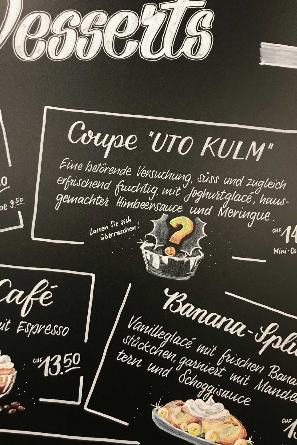
One example is the 2.50-metre-high menu board at the Uto Kulm restaurant on the Uetliberg. The lunch menu specials are presented there in white lettering on a black background. A large mirror panel informs guests about the programme for the year, including the Sunday brunch and the tête-à-tête special with a candlelit dinner and an overnight stay. ‘A board like this is something different from a printed one – clean and clear, but still playful,’ Uto Kulm proprietor and deputy director Fabian Fry stresses. He first met the creative duo when he was working in the sales team at the Hotel Hyatt, where the pop-up restaurant Hunger was opened.
However, there are a lot of pitfalls involved in this craft. The distances between letters have to be regular, and the graphic elements and any logos or illustrations have to be in balance with one another. Too much, and it would look cluttered; too little, and it would seem empty. Also, the script must not be too ornate, or else people would no longer be able to read the message – and there must not be any spelling mistakes. Barbara Vaterlaus is familiar with all these traps, and she has worked out a very detailed routine over time. She also holds lettering workshops where she passes her knowledge on.
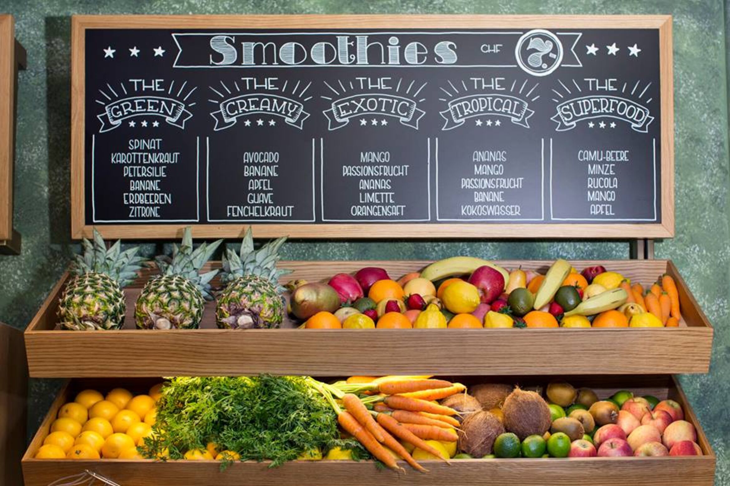
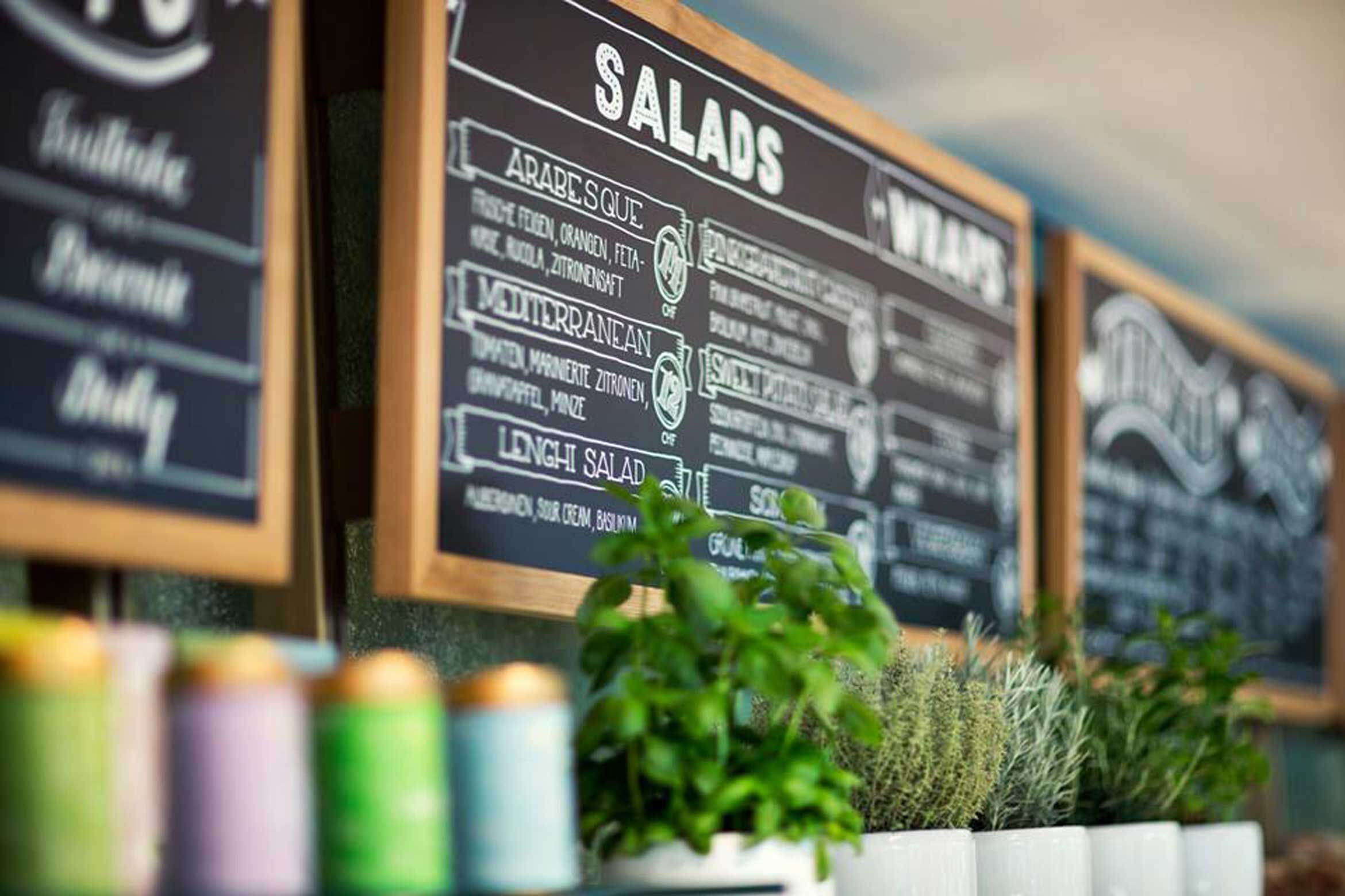
Different Design also supplies customers not just in Zurich but in other cities, too. Their menu boards have even appeared on the Swiss TV programme Bumann der Restauranttester. The restaurants or bars supply the text, and then Barbara Vaterlaus produces one or two drafts with a variety of script fonts and layouts. ‘The board needs to match the ambience of the venue,’ she says. ‘I would never use an ornate font in a car park.’ Once the customer has approved it, she gets down to work. She works on smaller boards at her studio in Frauenfeld and sends them out by post. For larger boards, she does the work on site. Depending on the script font and the size of the board, she can put several hours’ work into each of her boards.
Script fonts are tailored to the individual company.
‘If you are communicating just individual product groups, the boards will remain current for longer and it will be worthwhile to have slightly more elaborate lettering,’ Roland Vaterlaus explains. Their most popular product is customised boards that are tailored precisely to the individual establishment. Blackboards with reclaimed wood frames are also very popular. Some customers also like genuine slate boards, but they are very heavy, and this means they are not available in all sizes.
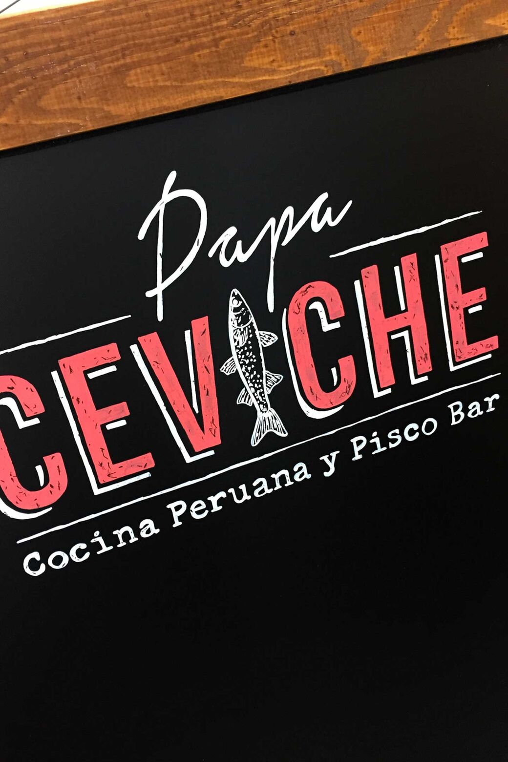
‘Something that is handwritten adds value, because you can see that there was a real person behind it,’ Blerim Ismaili emphasises. He has already collaborated many times with Different Design on behalf of various agencies. He has had customised advertising boards that blend in with the location’s interior created for events or bars on behalf of a wide range of brands. One example was the pop-up project ‘Die Apotheke’ in the garage of Zurich’s Amboss Rampe bar. Ismaili, a communication specialist, is aware that there are also script font programs that recreate the effect of calligraphy. However, they are not the same thing, because, in his words, ‘the personal touch is missing’.